Fill Light
In film school, we are taught the fill light goes on the opposite side of the key. This of course makes sense. A fill light is meant to open up the shadows, and therefore should go on the side of the face with the shadow. This is what I learned first year of high school (as did everyone else who ever took a film class, or watched a lighting tutorial) and I stuck with it. It was not until my freshman year of college I learned from my professor (the incredible Dana Kupper,) about the concept of “same-side fill,” a technique she claims to almost exclusively use. I have since learned that many cinematographers favor the technique. Shane Hurlbut comes to mind. And the covelight, popularized by Roger Deakins, can be considered an application of this technique. Soon after, I was introduced to the concept of fill lighting from directly on the axis of the camera, above the lens. In fact, this seems to me to be historically the most common fill position in film. The concept of fill positions has since been on my mind. For the last couple years I have been utilizing the various options on different projects, and theorizing what differences they make. Recently, I decided to finally do a formal test myself. I am in no way the first person to do this (though information on the specific subject is rare.) Art Adam has a great article on this exact subject which I really love, and can be found here. https://www.provideocoalition.com/fill-light-the-underdog-of-lighting/. I simply wanted to conduct the test for myself in a controlled environment, and decided to share the results here.
The Test
The test was conducted in an interview style setup using three lights (a traditional three point lighting set up.) I did not light the background at all in order to keep it as dark as possible for the test. I wanted a soft key, though not too soft, as to maintain shadow. I used an Aputure 300x through a medium sized softbox. The fill was another Aputure 300x, pushed through a large sheet (about 4’x4’) of 216. This light and diffusion moved positions during the test, though the distances were kept as similar as possible, that is, about 5 feet between the light and the diffusion, and 6 feet between the diffusion and the subject. By the way the subject was my good ol’ pal Cooper Olson. That does not matter for the test, but shoutout Cooper. Btw ignore the half mustache. Also I bounced an Aputure 60x into a small Ultrabounce as a backlight. That also does not really affect the test, but hey another shoutout. And if we are doing shoutouts, another one for Danny Gamez for providing the space.
I shot the test on a BlackMagic Pyxis 6k with a 50mm Sirui Venus anamorphic which has a 1.6x squeeze. I also decided to test color temperature with the fill lights. My key was 4500K and my camera was set to match. For each fill position I did one with the fill matching the key at 4500K, and one with the fill a bit cooler, at 5600K. For all shots, I shot in LOG and put a rec.709 conversion LUT with no additional coloring. Below are the results with my thoughts after.
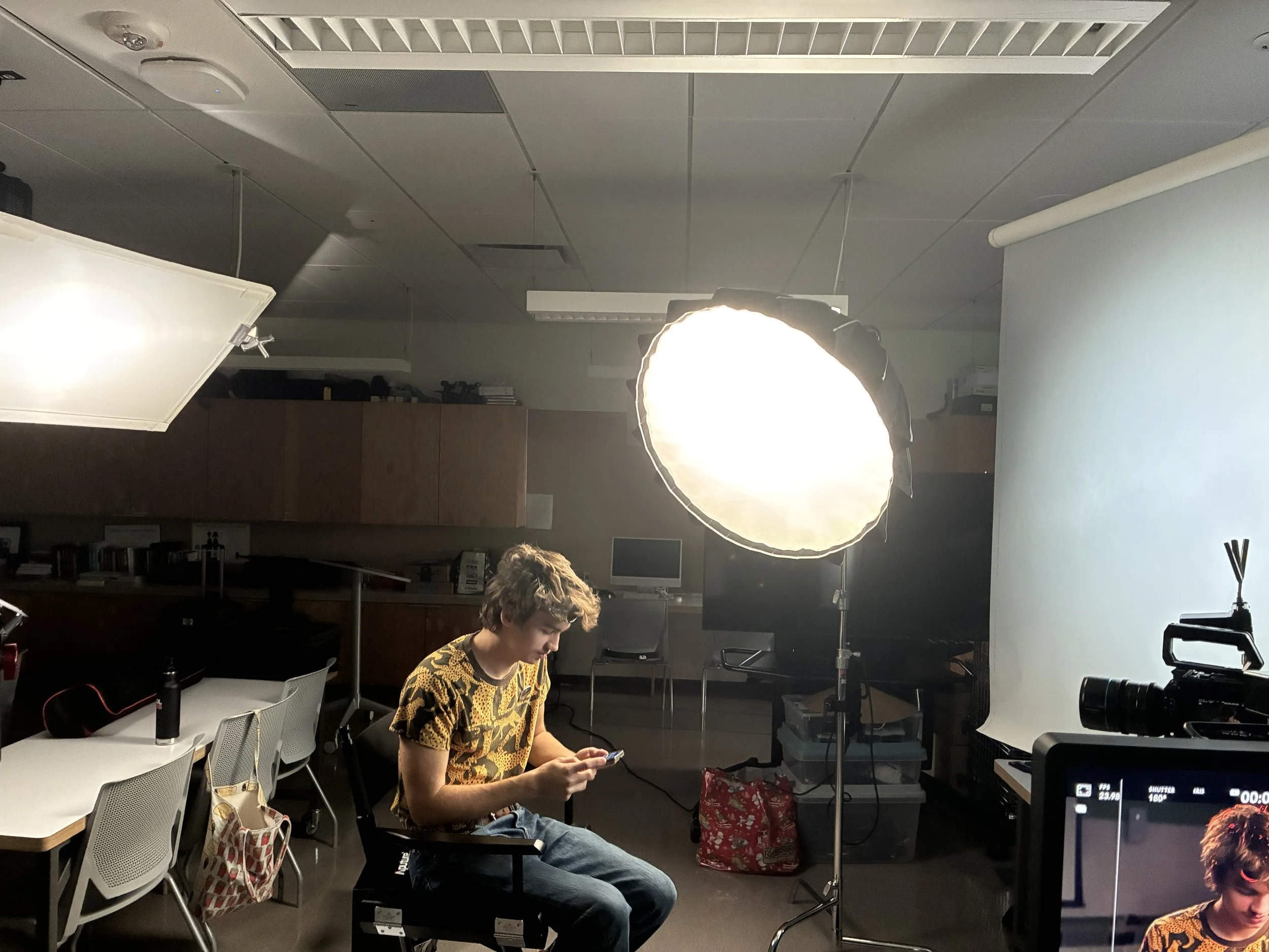
Set up of test (key-side fill at 5600K pictured)
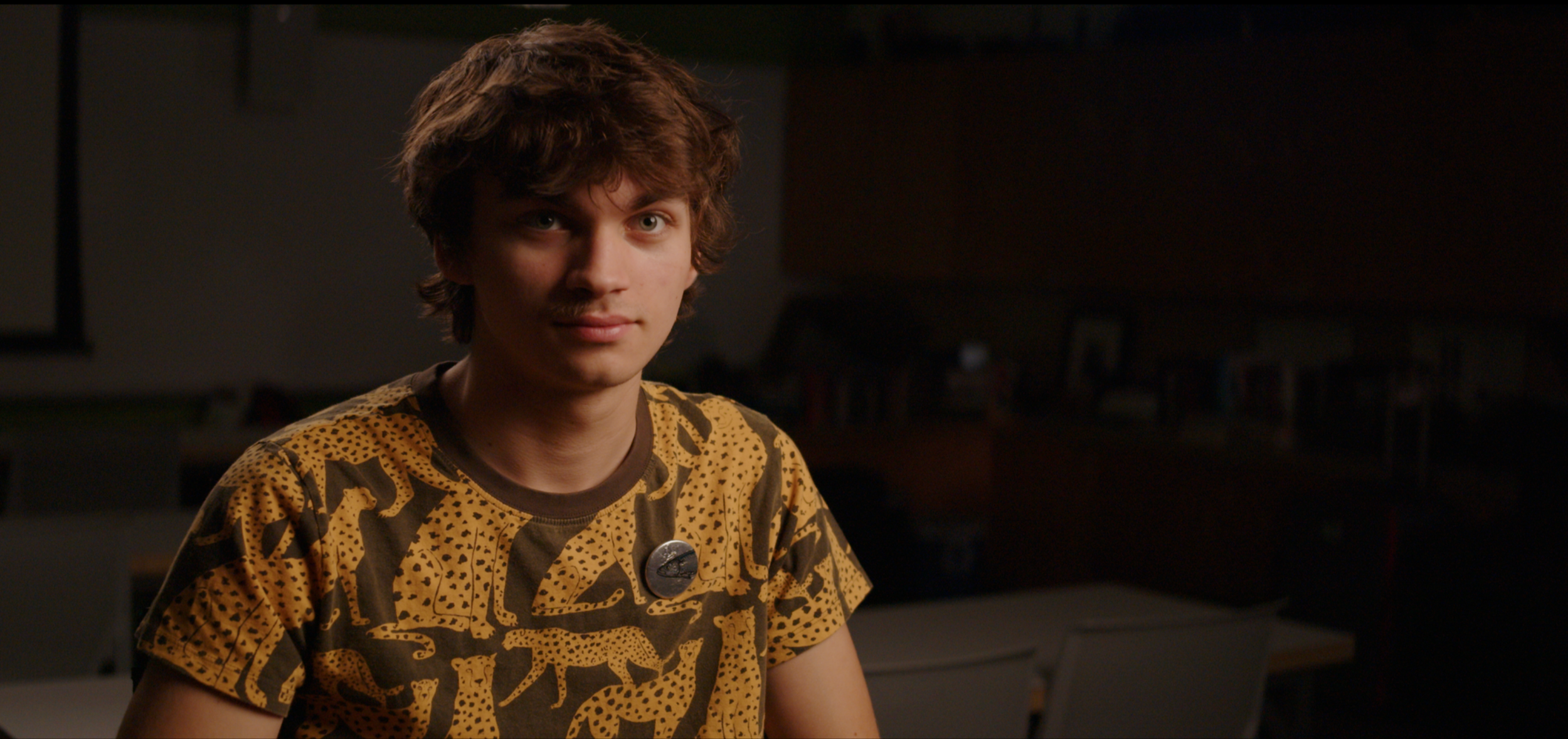
Control Image With No Fill
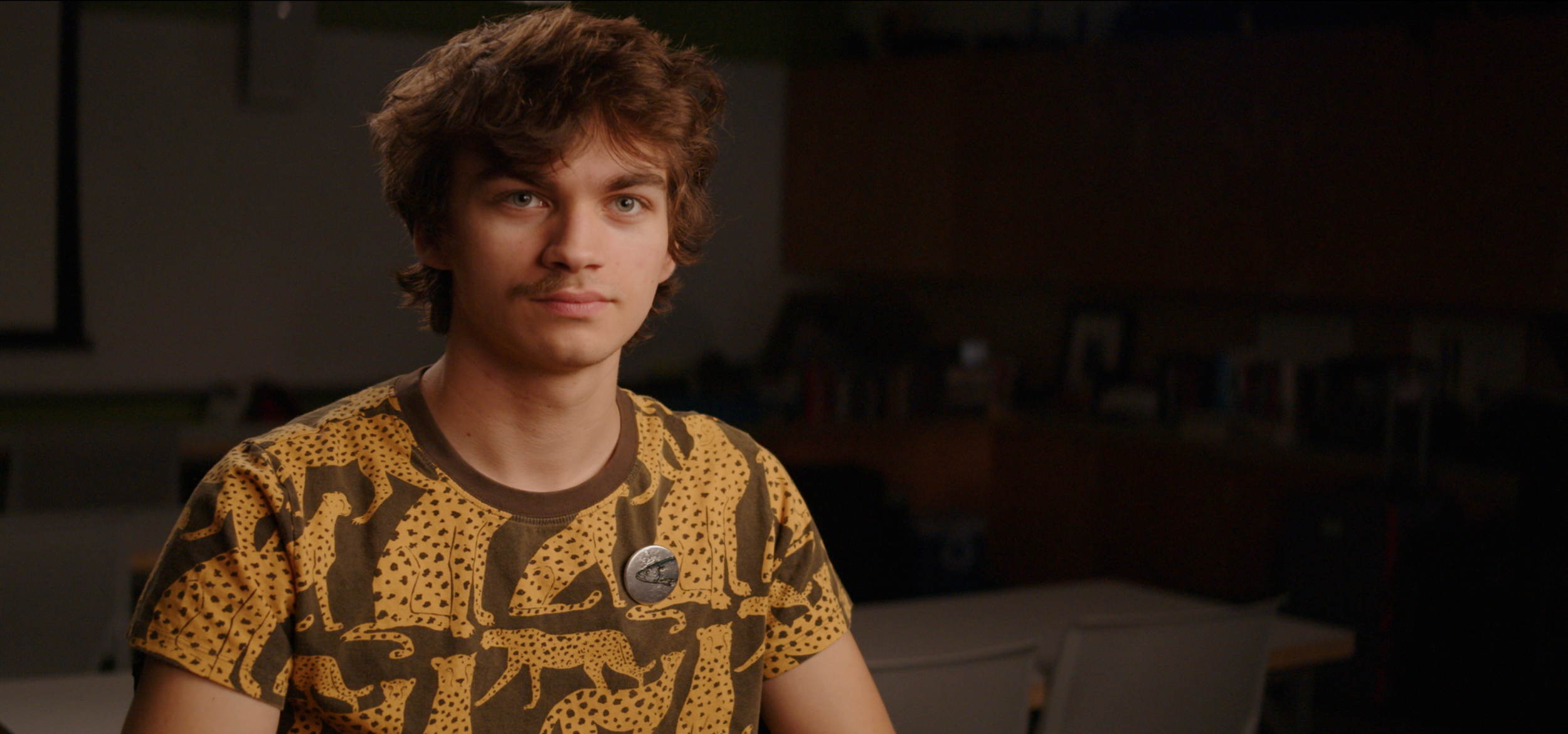
Key-Side Fill, matching key at 4500K.
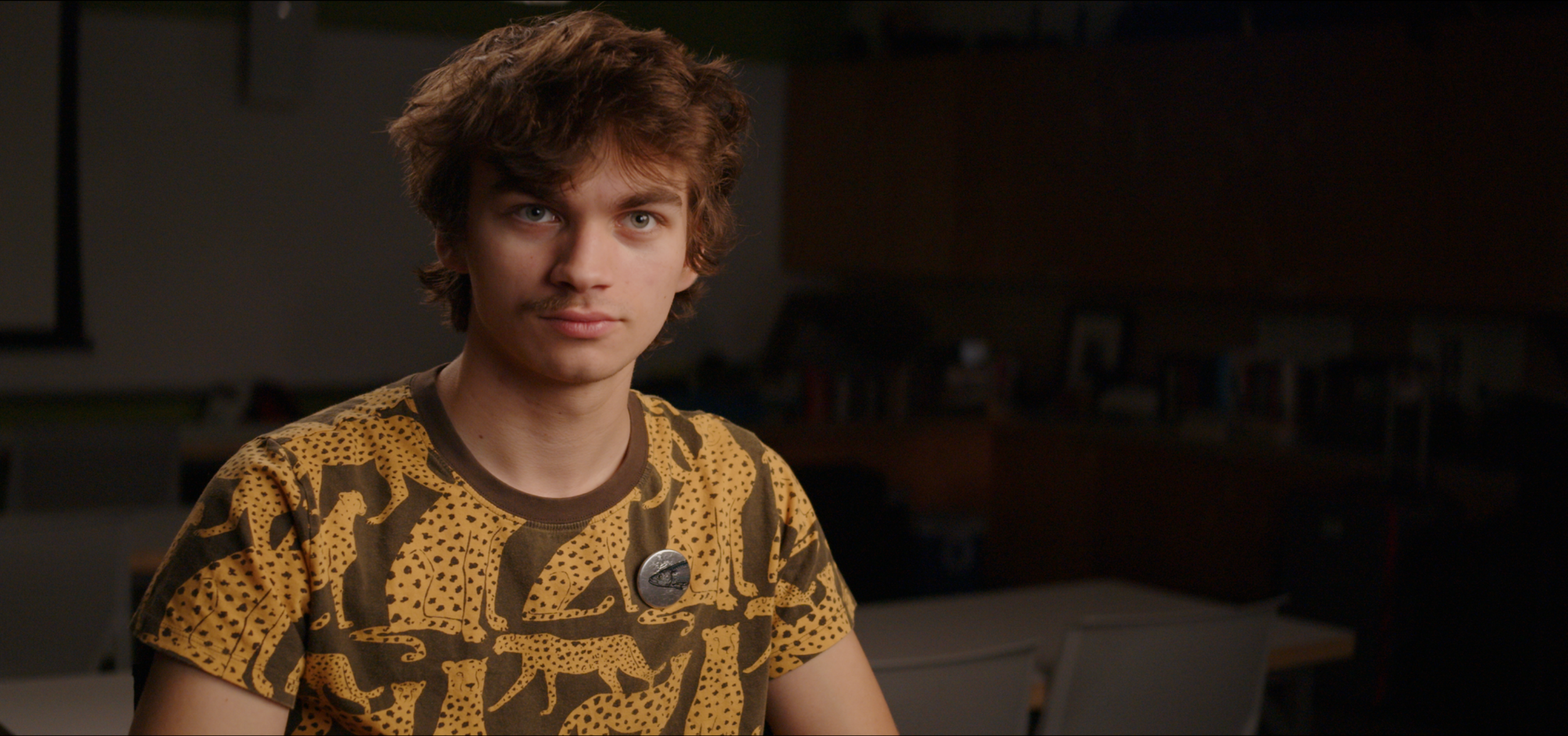
Key-Side Fill at 5600K.
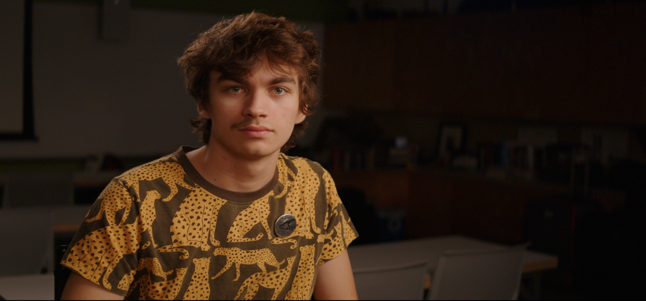
Fill Directly Behind Camera at 4500K
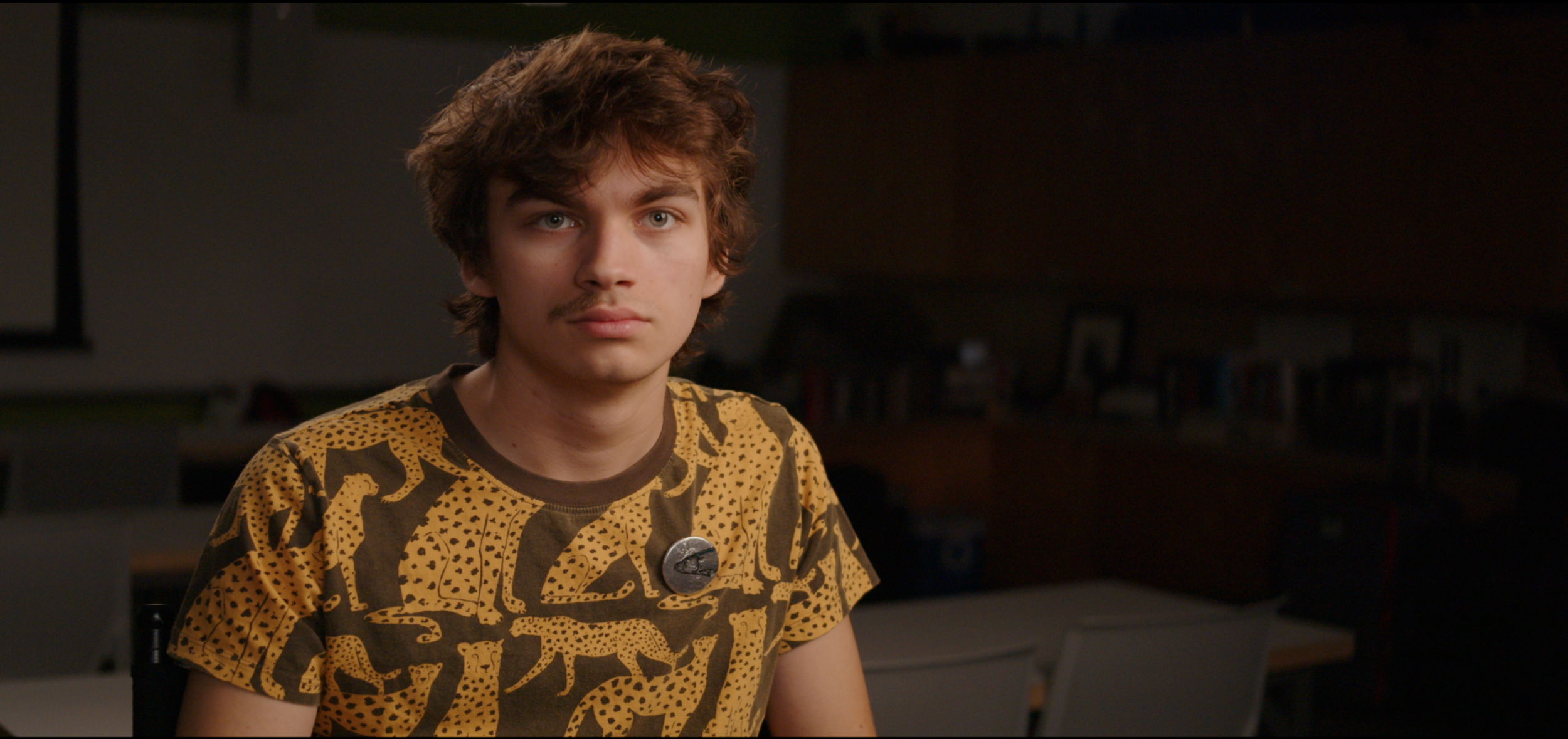
Fill Directly Behind Camera at 5600K
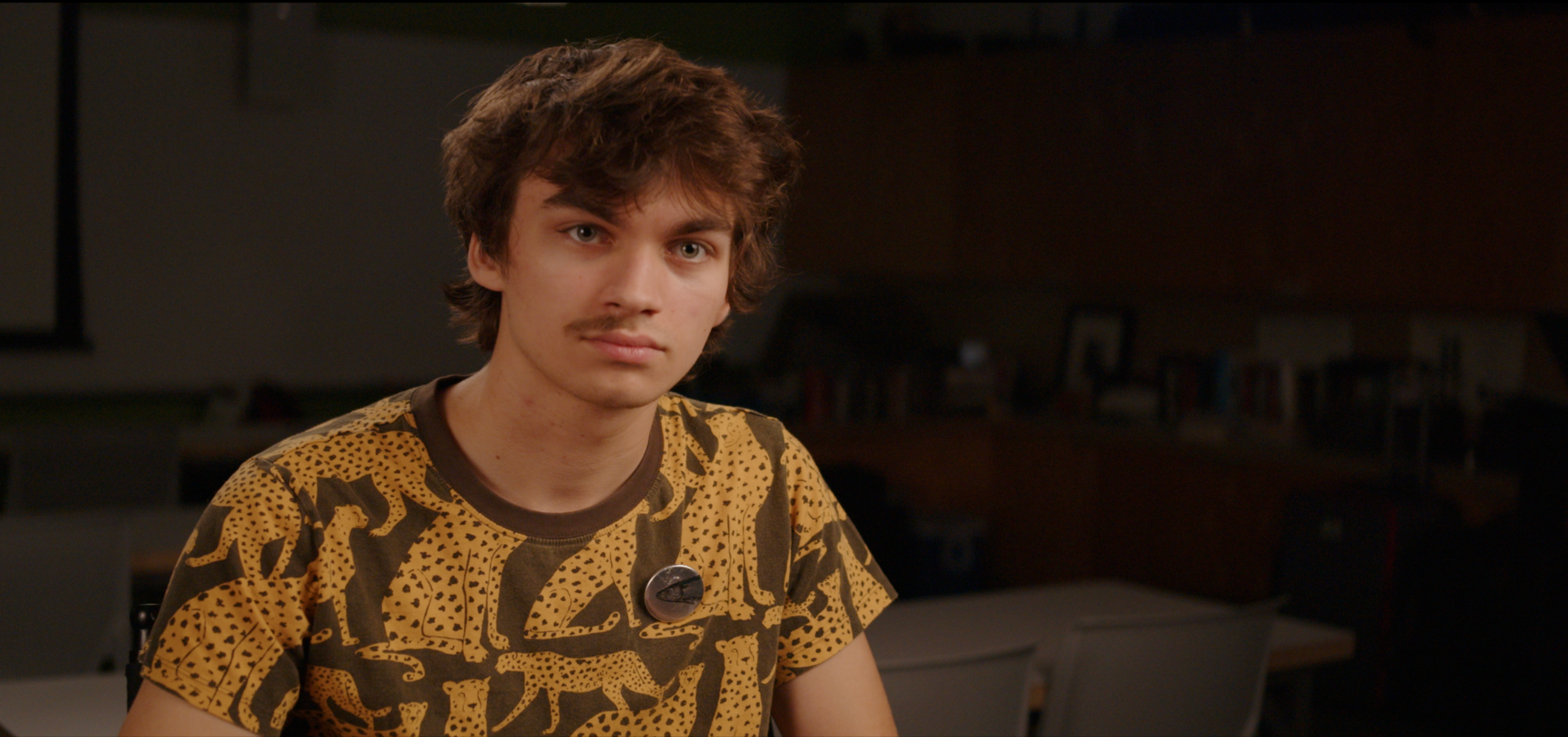
Opposite Side Fill at 4500K. (Admittedly, the fill is probably accidentally a bit closer to Cooper than in the other cases adding some intensity. My bad. The results are still seen however.)
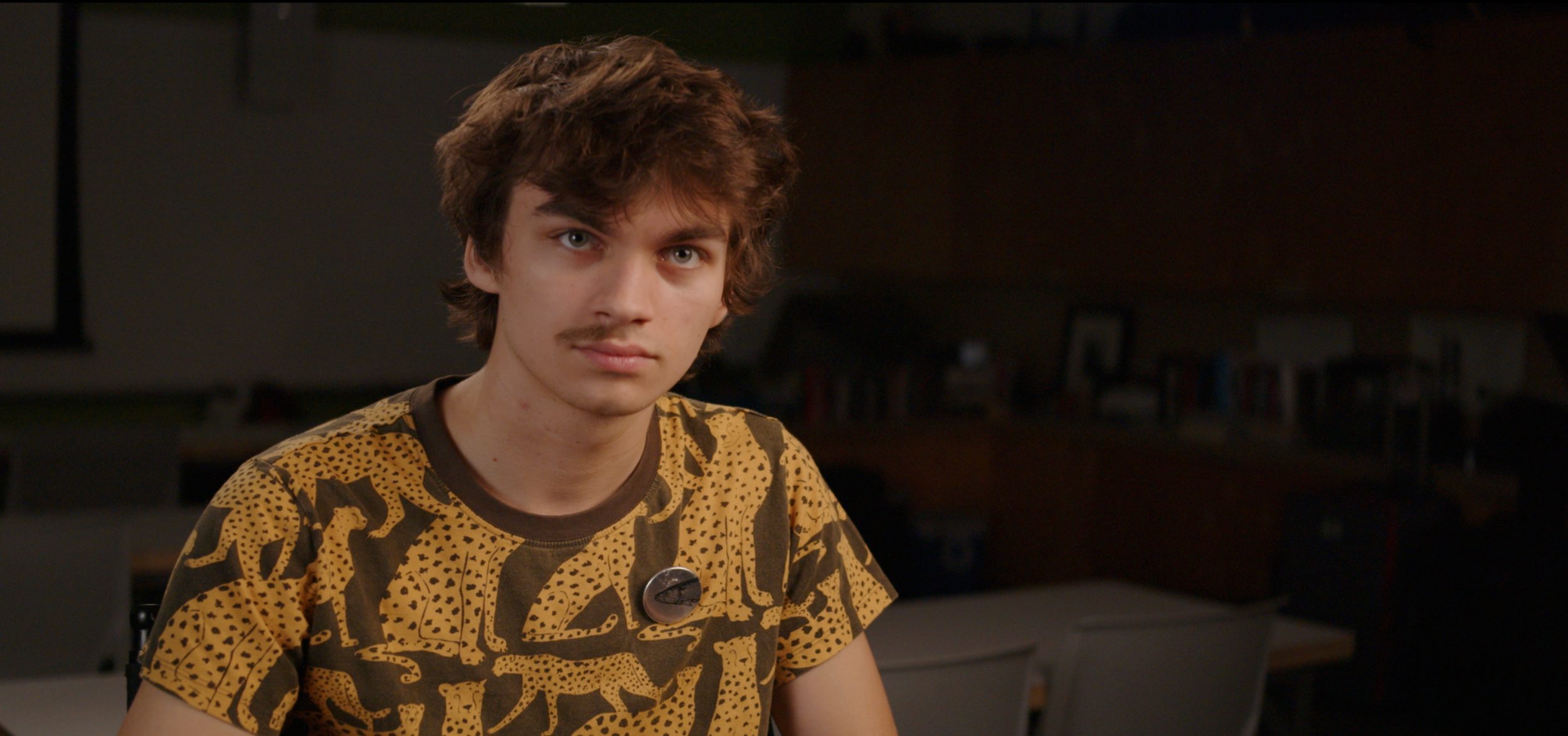
Opposite Side Fill at 5600K
Results
The key-side fill creates the most tonal range within the shadow side. The darkest parts are on the camera left side of his nose and leftmost furthest part of his face, where both the key and the fill do not reach. It falls off as it moves further away. Because of this, this fill position creates the most shape while still opening up the shadows overall. It also creates the most natural feeling eye light, with the two sources on the same side close together, giving the illusion of one source.
The fill on the camera axis flattens the shadows a bit more, essentially creating one tone. I feel the frontal position would perhaps work best for beauty shots, working to mitigate wrinkles and blemishes. The eyelight is also pretty centered here, perhaps a bit too centered and contrived for my liking, though it of course depends on where they are looking.
As mentioned, the traditional, opposite side fill has apparently moved a bit closer to Cooper than the others, brightening it up a bit, however the effects are still seen. I feel like this position has almost the opposite effect as the key-side fill, falling into deeper shadow as it nears the key side, creating a weird dark line in the middle of the neck. The furthest side is also flattened quite a bit. Because of this, this position feels the most unnatural. You could feel another source coming in from the shadow side.
As for color temperature, in all cases, either one looks ok on its own, but when compared side to side, weirdly, the cooler fill feels more natural and the matching one seems to be even warmer than the key. My theory is that this coincides with the phenomenon of associating cooler colors with darkness. In addition, the fill being cooler than the key creates some subtle depth. Cool colors recede while warm colors advance.
Of course, there are countless other possibilites for spill. From above, from below, no fill, neg fill, etc. It is also possible to combine them. For example, a fill on the side of the key with an additional fill, even lower intensity directly behind camera to open up the densest shadows slightly on the fill side. These are just the few, common ones I tested.
